
This is a reference build — a public brief we used to demonstrate a specific engineering discipline. See Client engagements for paid project work.
Overview
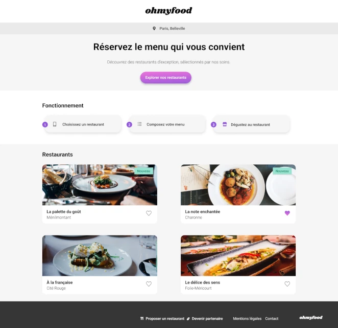
Food sites fail in a very specific way: they look fine in a screenshot and feel dead the moment you touch them. The gap between those two states is almost entirely a motion problem (not an art direction problem, not a copy problem, not a menu problem). This build was an obsessive study of that gap, and the five details that decided whether the site felt alive or just looked good in the Dribbble shot.
The build
A mobile-first multi-page FoodTech site: homepage plus four restaurant pages, entry loader, progressive menu reveals, animated favorite toggles, dish selection feedback, all in pure CSS and Sass, with zero animation libraries.
The self-imposed rule
No JavaScript for motion. Every animation had to live on the compositor thread: transforms and opacity only. If an effect couldn't be done with CSS and keyframes, it didn't ship.
The structural test
Four restaurant pages with unique content but one shared system. A fifth restaurant had to be a content addition, not a code addition. Copy-paste was forbidden at the architecture level.
The outcome
A site that feels responsive under the thumb on a mid-range Android, reveals its menu with deliberate pacing, and respects prefers-reduced-motion without a single JavaScript check. Live URL above, inspect anything.
A note we'll keep short because it's been said twice already in this collection: Ohmyfood is a recognizable training brief. We're publishing it as a craft study. The interesting question on a known brief is never "did you ship it" but "what did you obsess over that nobody asked you to obsess over." The rest of this case is that answer.
The five details that took the longest
Most of this build was fast. A handful of specific details ate a disproportionate share of the time, and they're the only things that actually matter in the final experience. Here they are in the order they were resolved.
1. The entry loader timing
A loader is not a spinner. A loader is a promise. Get the duration wrong and it either feels broken (too fast, the user thinks nothing happened) or insulting (too slow, the user feels manipulated into waiting for a site that has nothing to load).
We landed on a total loader duration between 1.5 and 2 seconds, with a cubic-bezier easing that accelerates into the end. The curve matters more than the duration. A linear fade feels mechanical, a sharp ease-out feels impatient, the controlled acceleration feels like the site is arriving. This detail is invisible on any screenshot and impossible to notice in isolation, but it sets the emotional temperature of the entire visit.
2. The menu item stagger
When the menu reveals, each dish enters the scene with a progressive delay. The naive implementation uses the same delay increment for every item, which produces a mechanical, marching feel. The right implementation uses a slightly decreasing increment so the first few items arrive with visible rhythm and the later ones catch up faster, preventing the reveal from dragging on the long menus.
Implemented via :nth-child selectors with hand-tuned animation-delay values. No JavaScript, no library, no runtime calculation. A purely declarative stagger that the browser orchestrates on its own.
3. The favorite heart, in two layers
The classic implementation of an animated heart favorite uses a color transition: grey to red on click. It's fine. It's also completely flat. The version we shipped uses two stacked hearts (an outlined one on the bottom layer, a filled one on top with a clip-path that reveals from bottom to top on the hover/click state). The fill looks like it's pouring in. Same amount of code as the color transition. Infinitely more satisfying.
The detail that took the longest here was getting the fill direction to feel natural on both desktop hover and mobile tap. The tap version needed a slightly longer duration to register as intentional on a touch interface, where the user can't preview the effect with a hover.
4. The dish selection tick
When you mark a dish as selected, a checkmark slides in from the right edge of the card. This is the one effect where the naive implementation absolutely breaks: using width or left to slide triggers layout recalculation on every frame, which causes jank on anything below a flagship phone.
The shipped version translates the tick on the X axis only, with the slot pre-reserved in the layout and the tick positioned absolutely within it. The transform runs on the compositor, the main thread stays free, the animation is smooth at 60fps on a 2020 Android mid-range. This is the single most important technical detail in the build, and it's invisible if you don't know to look for it.
5. The respect for prefers-reduced-motion
Every animation in the build is wrapped in a @media (prefers-reduced-motion: no-preference) query. Users who've opted out of motion get the final state immediately, with no transition at all: not reduced transitions, not faster transitions, zero transitions. This is the correct implementation and not the common one. Most sites "respect" reduced motion by shortening durations, which still triggers vestibular responses in the users the setting exists to protect.
The detail that took the longest was the loader: reduced-motion users can't see a fade-in loader without getting the exact effect they've opted out of, so the loader is skipped entirely for them and the content renders immediately. That conditional required a structural decision about when the loader markup gets rendered, not just when it animates.
Things that didn't work on the first try
The honesty section we've been running on every case study in this collection. Here's the shortlist of what broke, what we tried first, and what we shipped instead.
- The first stagger was computed. The initial implementation used a Sass
@forloop to generate delays: mathematically clean, visually uniform, and boring. Hand-tuned values ended up being the right answer because the ear-feel of animation timing doesn't follow arithmetic. - The heart used SVG morphing initially. We tried
pathinterpolation between an outlined and filled heart. It worked, but required a JavaScript dependency for reliable cross-browser behavior, which violated the self-imposed rule. Two stacked hearts with a clip-path was the second attempt and the one that shipped. - The mobile breakpoint was wrong for two days. We started with 768px for the tablet transition because "that's what everyone uses." It produced an ugly narrow-tablet state on 834px iPads. Breakpoints chosen from content inspection (not from device presets) fixed it. The lesson: breakpoint values are not design tokens, they're content questions.
- The loader once showed twice. A navigation-level bug caused the loader to fire again on internal route changes during an early build. Not shipped, but worth mentioning: "only run the loader on cold page loads" is a rule that sounds obvious until you forget to enforce it.
Tech stack
- Semantic HTML5
- Sass (Dart Sass, 7-1 architecture, BEM naming)
- Pure CSS animations (transforms and opacity only)
- CSS custom properties for theme tokens
@media (prefers-reduced-motion)respected throughout- Lighthouse, axe DevTools, W3C Validator (quality gates)
- Chrome DevTools Performance panel (jank hunting)
- Git / GitHub
What we'd add for a real client today
Brief honest section on what the next version of this build would look like if the constraints were negotiable.
content-visibility: autoon off-screen sections. For a site with four long restaurant pages, skipping rendering work for content that's not in the viewport would meaningfully improve TBT on mobile.- Container queries instead of media queries for the menu card. The card appears at multiple widths depending on parent layout. Container queries would let it adapt to its own context instead of guessing from viewport width.
- Real image art direction via
<picture>. Currently the hero images are responsive viasrcset, which is fine for sizing but can't handle the "different crop on mobile vs desktop" case that food photography actively benefits from. - View transitions API for page navigation. For a multi-page site with this much visual continuity between pages, the View Transitions API would turn page-to-page navigation into a single continuous experience instead of four separate loads.
None of this was in scope. All of it is where the next iteration lives.
What this build reveals
Motion work is the part of the front-end industry that gets talked about on Twitter and under-delivered on in production. Most sites have the ambition and none of the discipline: effects that jank on mid-range phones, ignore reduced-motion, depend on 200KB of animation libraries to do what 40 lines of CSS could do better. The discipline is in the restraint: fewer animations, chosen more carefully, implemented so cheaply that performance is never the question. We care about this more than is commercially rational, and it's the reason clients who care about feel end up working with us.
If you have a build where motion and micro-interactions genuinely matter (a FoodTech product, a luxury brand site, an editorial experience, a marketing page where the first ten seconds decide the visit), this is the engagement we're built for. The first call is a 30-minute working session where we look at the Figma, identify the three or four animations that will define the whole experience, and tell you honestly whether your timeline allows us to do them properly. If the answer is "your deadline is too short for the level of craft you're asking for," we'll say so in the call. Straight answers only.